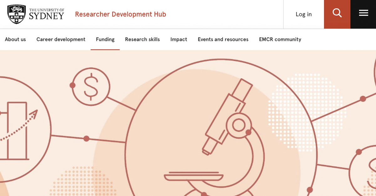
It's true that a picture is worth a thousand words, and the words that any picture at the top of a web page tells have to be spot on, if it's to grab people's interest.
We were approached to create a set of illustrations &emdash; over 40 in total! &emdash; to grace the pages of the new University of Sydney Researcher Development Hub website. The website itself houses a rich array of resources for researchers, including career development advice, how to get research funding, ways to get published, networking, and more.
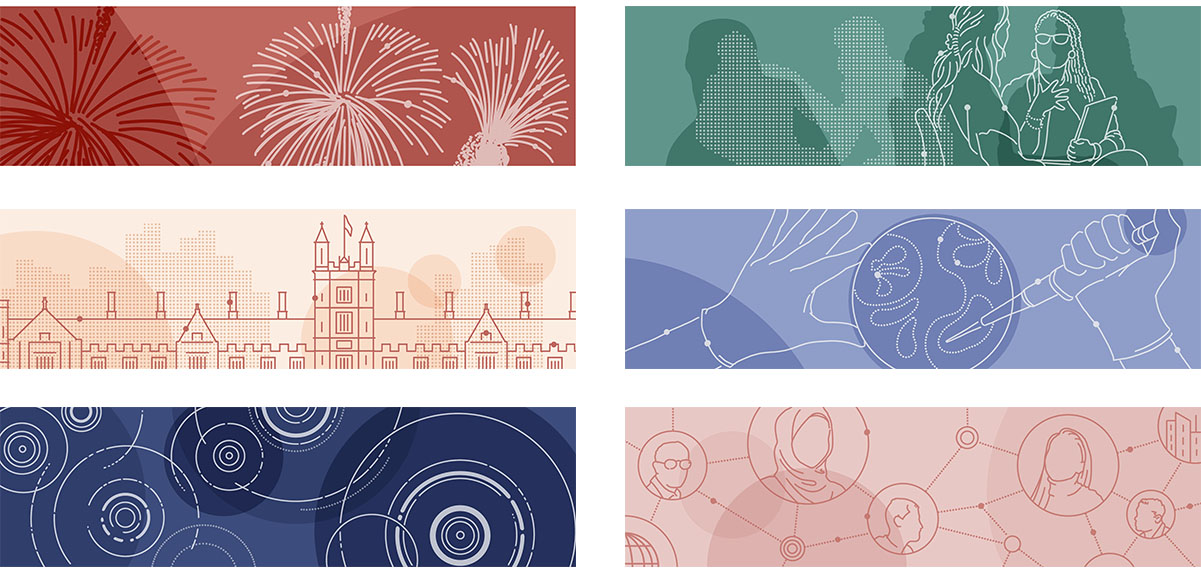
A small selection of over 40 website header illustrations created
Telling a story across all illustrations
The client had a clear, strong vision for not only the impact the website was to make, but the ethos and character of the site itself. Research might be a dry topic for some, but for those embedded in months and years of research activity, it really is all about the people. The people researchers engage with in research itself, as well as peers at the university and around the world, are so formative to one's career, wellbeing, and opportunities.
We collaborated with the whole team behind the website, from running initial focus groups, engaging with the Brand team, all the way through several rounds of steering and changes. What made this project special was being able to find out from stakeholders how they'd like to feel once they had been to this website. Illustrations are inherently subjective, and it was important to strike the right tone: people wanted to feel inspired, reminded of the importance of research, to feel more confident thanks to the resources available, and to know that they were never alone.
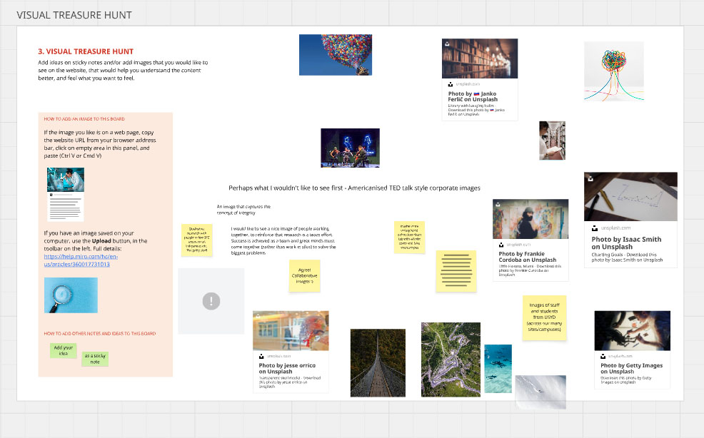
One of the stakeholder activities we ran on a Miro board
We chose to show a blend of topics to illustrate this discovering together story. We wanted to show realistic-looking people doing authentic things together, but we also wanted to spark curiosity, by showing various objects of research, as visual reminders of the wonder, preciousness, and intricate detail of the world.
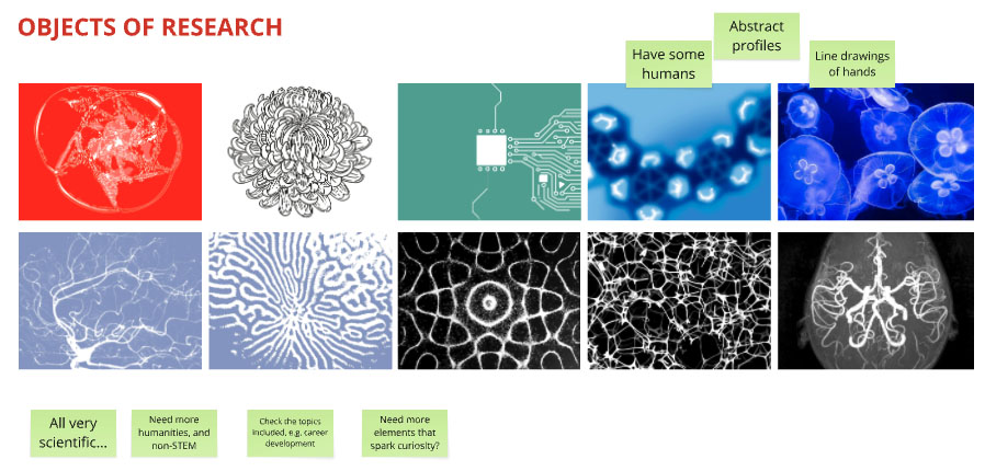
Some early draft ideas for illustrations, based on different objects of research
A balance of innovation and brand compliance
The University of Sydney has a strong, modern and progressive brand, with some very well thought-out branding elements to follow. When it came to illustration style, the direction and constraints were clear (minimalist monoline artwork with simple, plain backgrounds showcasing the vibrant colour palette), and presented quite a challenge. But through iteration and trying different variations, we landed on a look that was a unique blend of crisp technical line-work, organic forms, and interesting texture; truly a look and feel individual to the Researcher Development Hub.

An early draft of what would become close to the look and feel of the final illustrations
The final result
The client was so happy with the results that we were asked back to design some other elements, plus some more header images for new content.
